Costco Wholesale App Redesign
The Costco app provides their members with different features to shop online and easy access deals to save more money.
Duration February 2022 – April 2022
Role UX Research and Design Student
Tools Figma
Type Wireframes, iOS UX/UI, User Research
Defining the Challenge and Objective.
Although Costco is known for the quality of their products, their app has poor usability and outdated interfaces. The platform has an overwhelming amount of information which can be confusing and difficult to sort through. The wholesale app needs to focus on meaningful graphics and emphasize high priority tasks. Including new features like scan-n-go, products suggestion based on the members, and fewer clicks to checkout can encourage users to keep browsing the Costco app.
Problem Statement: How might we better improve the functionality of the app to make it easier for Costco members and non-members to find new deals while increase browsing time and personalizing the account to their interests?
Research.
I interviewed different groups of Costco app users and non-users to collect information and pinpoint problems related to the app. By asking non leading question and observing them while using the app.
Methods
Surveys: I created two different online surveys, one direct and one indirect to send to 15 of my peers. The goal was to see how they interact with shopping apps, what type of efficiency they expect while shopping online, and new user reaction to the Costco app.
3 Ethnographic Interviews: I sat down with two users of the app and one nonuser to discover what the app is lacking. I asked them to go about the app how they wanted while describing their thoughts and comments. Later I asked them to look for certain deals and to see how easy it was to navigate the app if they were not a Costco member.
Challenges
Homepage is too busy, with not many calls to action.
There is no scan-n-go, which all the users expressed they would love to use.
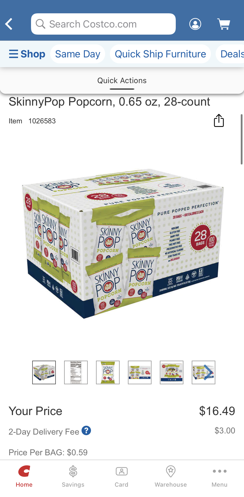
On Same day grocery, when clicking on a certain product, the top bar has the “x” and “back” button on top of each other which is confusing.
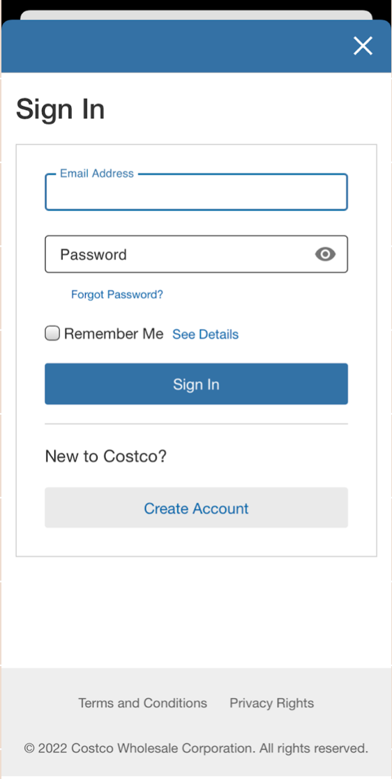
No continue as guest button, forces you to sign in for some features.
Too many words and not enough graphics to balance it.
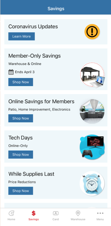
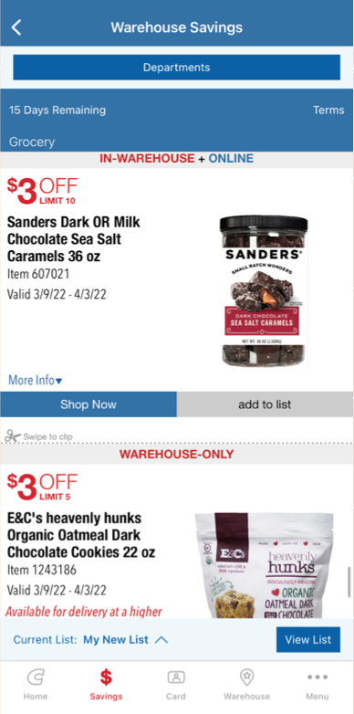
Costco’s Current Interface
User Persona.
Journey Mapping.
Ideate.
Competitors & Inspirations:
As a part of my research, I looked up other popular online shopping apps that my peers had suggested through the survey such as Sam’s Club, Amazon, Target, Walmart etc. These app were great to draw inspiration from and compare the strong suits each interface had.
After studying the pain points, user persona, and flow. I started to ideate an updated interface to increase user functionality and find solution to all the pain points.
Wireframe.
Mockups
Solutions
Loading and Home Screen
Costco did not originally having a loading screen. I created a simple one with the logo in the middle. The first major change on the Home Screen was implementing a grid layout, this helps the user feel less overwhelmed. For the top navigation bar, I included icons and reorganized the warehouse location and shop section. The screen has better flow while bringing attention to services the user might utilize often. I also included the members name on the screen to help the account feel more personalized.
RedesignOriginal RedesignOriginalSign - In Screen
The main change on the sign-in screen was including a continue as guest button. This way new user or user who don’t want to sign in can browse without having to put in their information.
Product Category
I have included icons for each category, to visually express the product and enhance aesthetic appeal.
RedesignOriginalOriginalsSavings Page
The main savings page had few changes, there is balance between texts and graphics. The major changes happened on the in-warehouse savings page. Users now have accessibility to filter out savings by category, name, size, and date etc.
RedesignsPrototype.
My goal for the redesign of this project was to create pages that were more cohesive and visually appealing. It was also to increase user browse time through account personalization and adaptability. As this was my first UX redesign, I found this project to be enjoyable. While I was creating wireframes and mockups, it gave me a deeper understanding on the importance of user research and testing.
I showed the prototype to the individuals I asked to do the user research and received positive feedback along with few changes that could further improve the app. In the future I would like to conduct user testing session with strangers for unbiased response.
Reflection


